Branding Identity

  • Client

  • Pikbag

  • Role

  • Graphic Designer

  • Type

  • Brand Identity / Visual Identity System

This branding project establishes a modern, minimalist visual system for PIKBAG, elevating its presence in the organic products and jewelry retail space through cohesive and elegant design.
1. Context & Objective


  • The Challenge: Operating in the competitive retail market for organic products and jewelry, PIKBAG needed a distinct and unified visual voice. The previous branding lacked the refined structure necessary to build strong consumer trust and stand out.
  • The Objective: To develop a comprehensive branding proposal that restructures the brand's visual architecture. The goal was to create a highly structured, scalable Brand Guidelines system that maintains consistency across all digital and physical touchpoints.


2. Core Concept


  • Brand Story: The visual direction is rooted in the philosophy of "luxury through restraint." By embracing European elegance and minimalist principles, the new identity reflects the purity of organic products and the premium nature of jewelry.
  • Design Direction: Modern, professional, and built on clean lines, ensuring the brand communicates sophistication without unnecessary clutter.


3. Design Execution


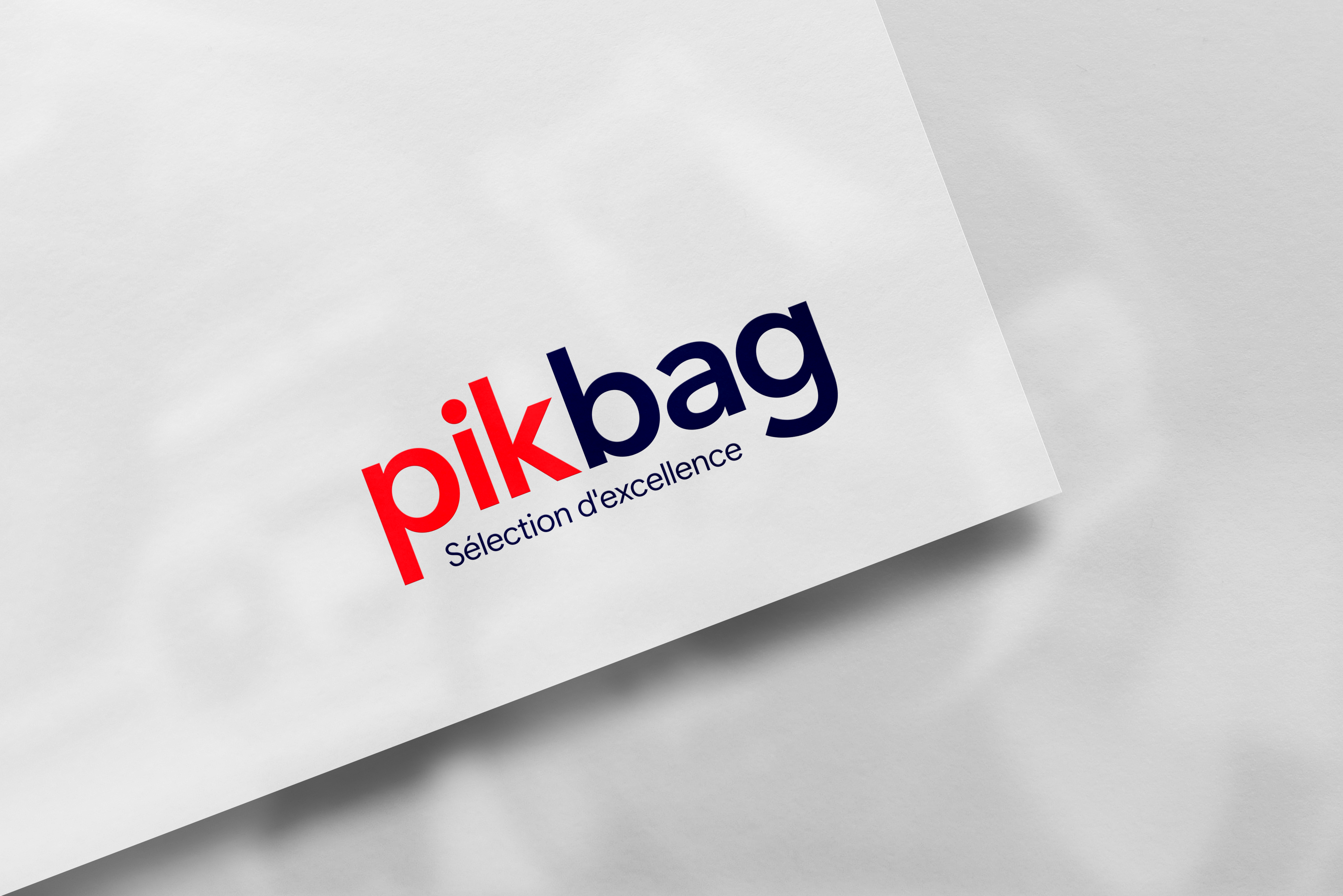
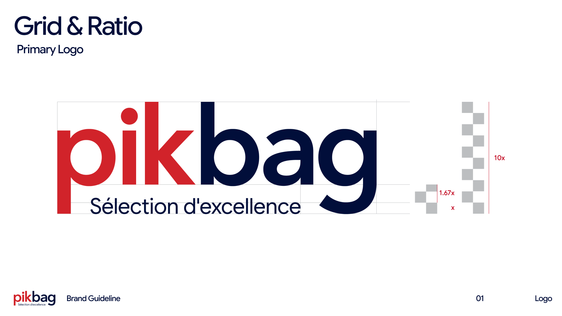
  • Logo & Typography: Central to the redesign are the distinct logo monogram concepts, crafted to be highly recognizable and scalable. The typography choices were deliberately selected to convey stability, readability, and a premium feel.


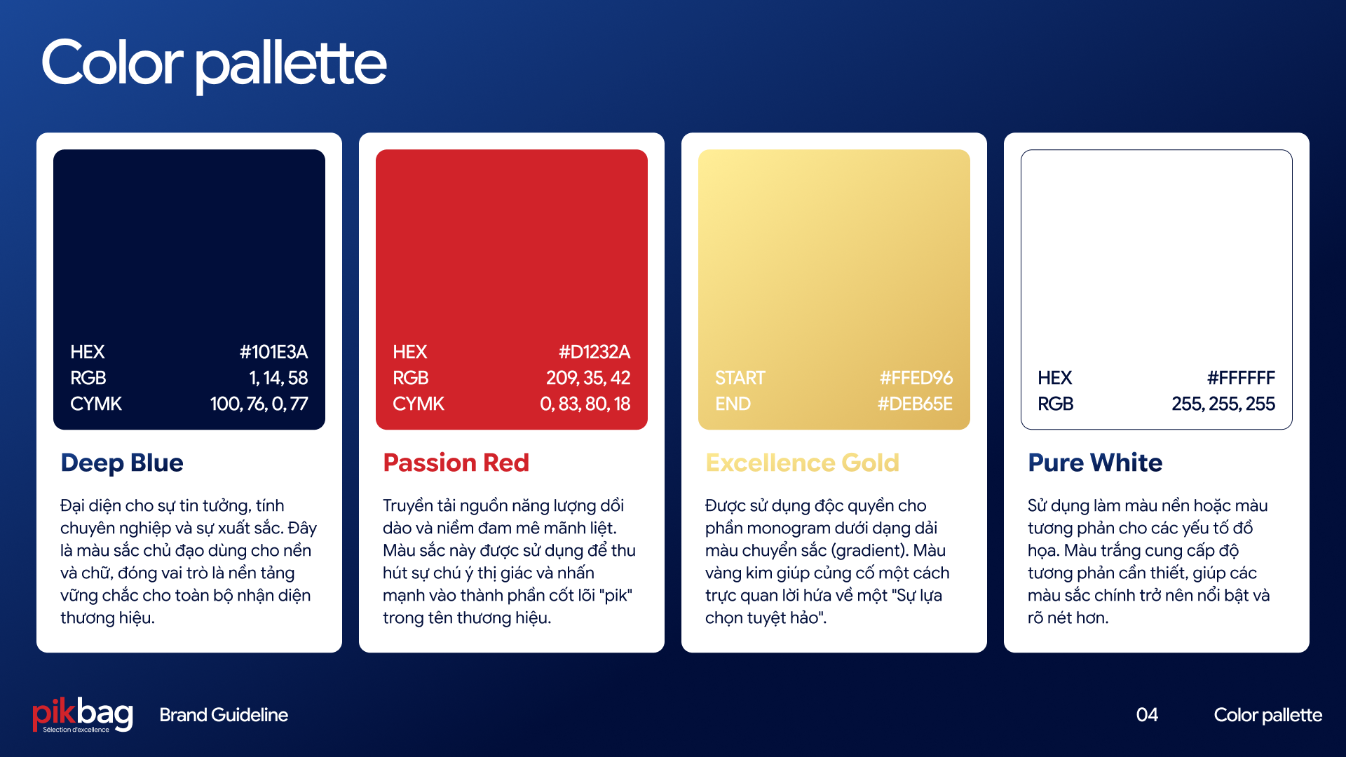
  • Color Palette: Utilizing a sophisticated palette that balances earthy, organic tones with neutral, elegant accents, perfectly aligning with the brand's dual focus on natural products and premium accessories.


  • Brand Applications: The new visual system was seamlessly integrated across multiple touchpoints, including:
    • Packaging: Premium tags, labels, and product boxes.
    • Digital: Social media templates, banners, and digital storefront assets.
    • Stationery & Retail: Business cards, shopping bags, and brand collateral.
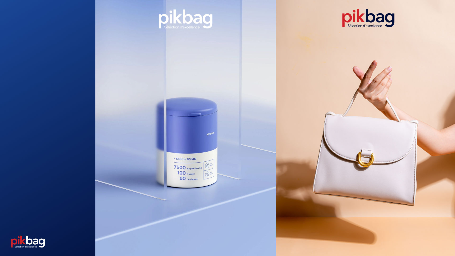


4. Outcome & Impact The redesigned identity provides PIKBAG with a highly professional, polished, and standout aesthetic. This cohesive visual foundation not only enhances brand recall and customer trust but also provides a robust, flexible framework for future marketing campaigns and business scaling.
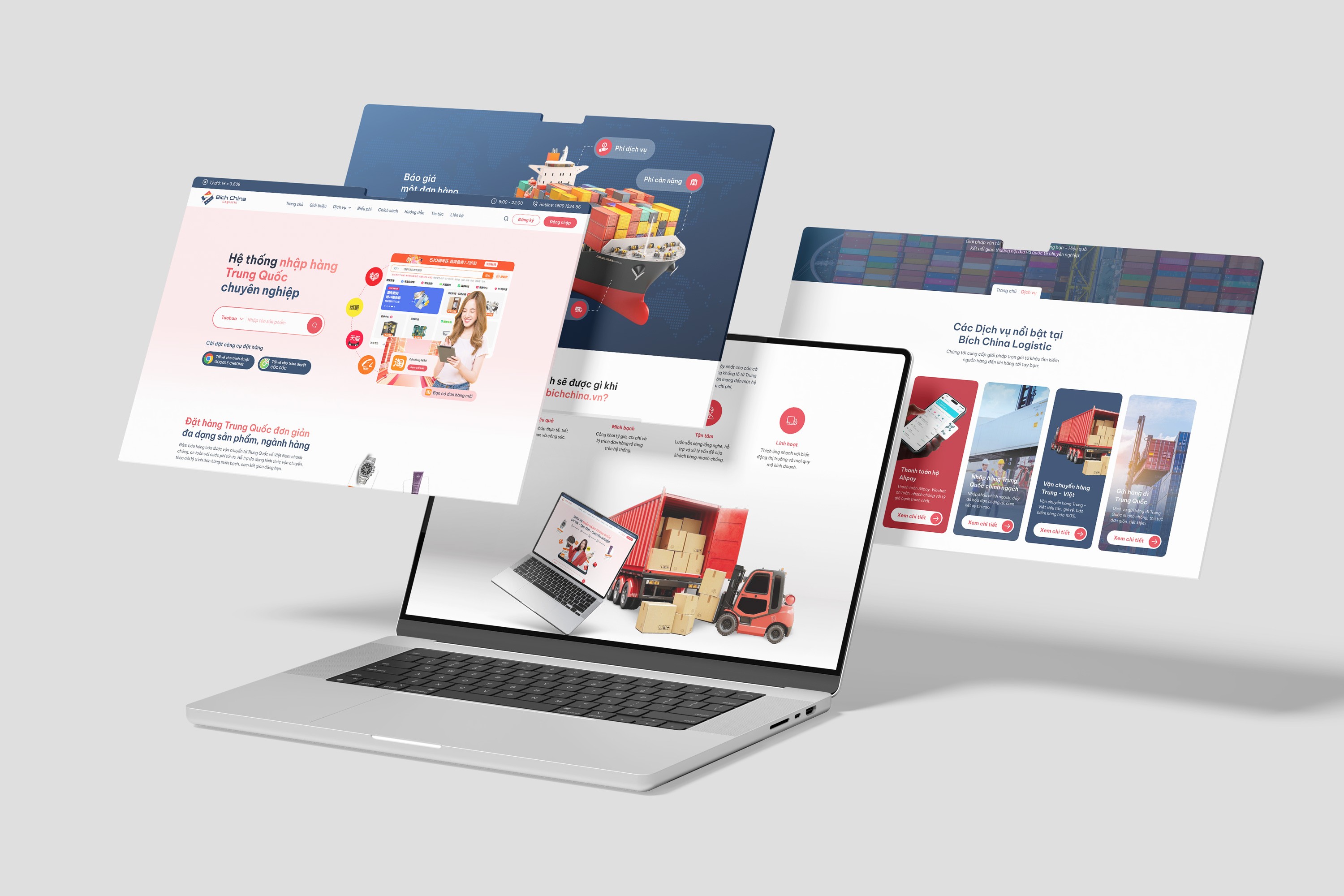
  • Project 01

    Website Redesign

  • Project 02

    Team Recruitment

  • Project 03

    Branding Identity

Let’s work together

© 2026

Home

Work

About

Alex Nguyen

Back to projects

Branding Identity

  • Client

  • Pikbag

  • Role

  • Graphic Designer

  • Type

  • Brand Identity / Visual Identity System

This branding project establishes a modern, minimalist visual system for PIKBAG, elevating its presence in the organic products and jewelry retail space through cohesive and elegant design.

1. Context & Objective


  • The Challenge: Operating in the competitive retail market for organic products and jewelry, PIKBAG needed a distinct and unified visual voice. The previous branding lacked the refined structure necessary to build strong consumer trust and stand out.
  • The Objective: To develop a comprehensive branding proposal that restructures the brand's visual architecture. The goal was to create a highly structured, scalable Brand Guidelines system that maintains consistency across all digital and physical touchpoints.


2. Core Concept


  • Brand Story: The visual direction is rooted in the philosophy of "luxury through restraint." By embracing European elegance and minimalist principles, the new identity reflects the purity of organic products and the premium nature of jewelry.
  • Design Direction: Modern, professional, and built on clean lines, ensuring the brand communicates sophistication without unnecessary clutter.


3. Design Execution


  • Logo & Typography: Central to the redesign are the distinct logo monogram concepts, crafted to be highly recognizable and scalable. The typography choices were deliberately selected to convey stability, readability, and a premium feel.


  • Color Palette: Utilizing a sophisticated palette that balances earthy, organic tones with neutral, elegant accents, perfectly aligning with the brand's dual focus on natural products and premium accessories.


  • Brand Applications: The new visual system was seamlessly integrated across multiple touchpoints, including:
    • Packaging: Premium tags, labels, and product boxes.
    • Digital: Social media templates, banners, and digital storefront assets.
    • Stationery & Retail: Business cards, shopping bags, and brand collateral.


4. Outcome & Impact The redesigned identity provides PIKBAG with a highly professional, polished, and standout aesthetic. This cohesive visual foundation not only enhances brand recall and customer trust but also provides a robust, flexible framework for future marketing campaigns and business scaling.

  • Project 01

    Website Redesign

  • Project 02

    Team Recruitment

  • Project 03

    Branding Identity

Let’s work together